
Your product, our analytics
Data storytelling leads to clear decision-making
- Deliver analytics insights in your next product cycle
- Tell the data story in your brand & UX
- Build natively in any cloud environment

Differentiated data products generate revenue
- Levels of analytics separate price tiering options
- Unique data and insight products are new revenue sources
- Analytics add-ons provide opportunities for account growth

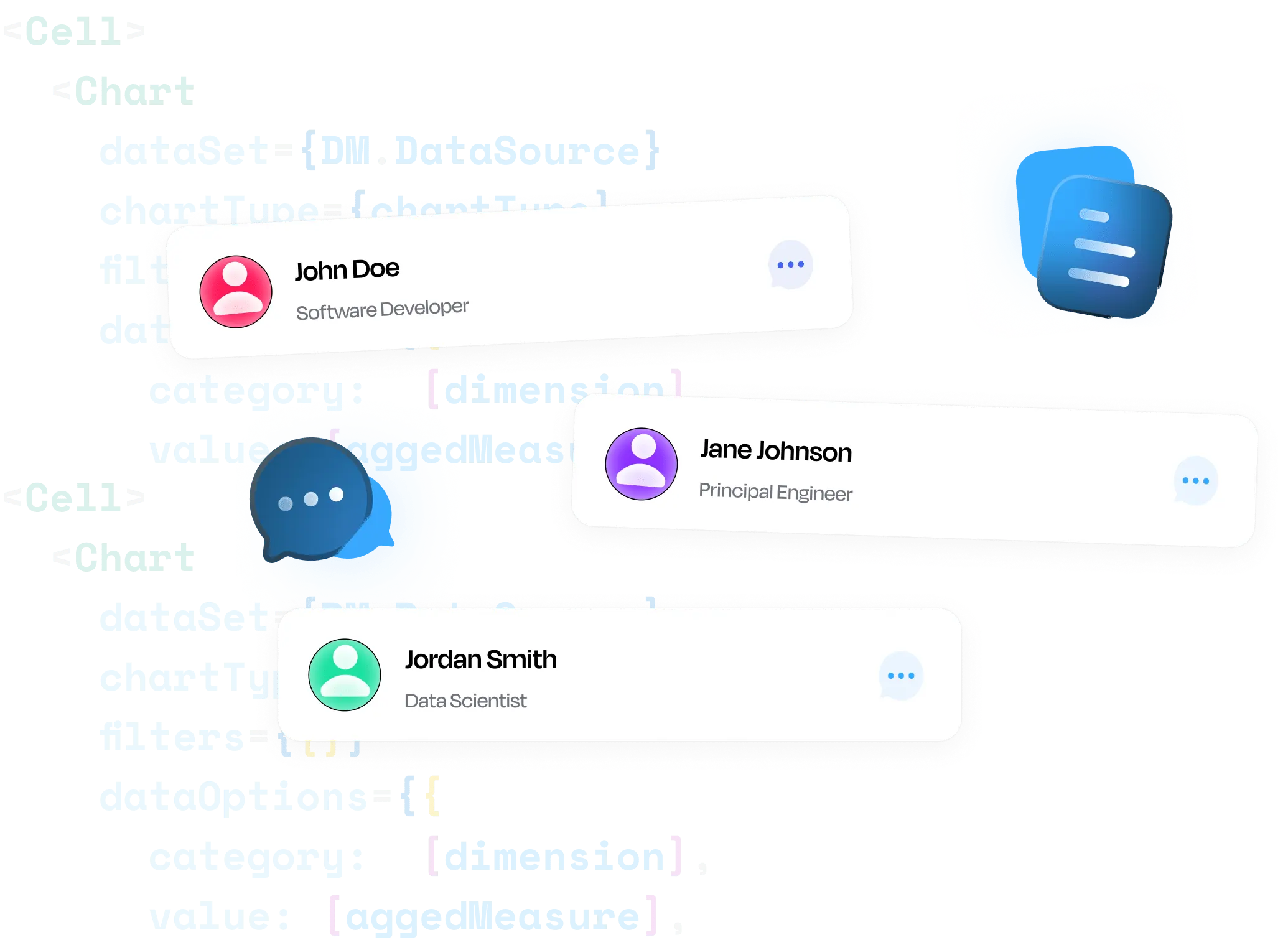
Tap into AI-powered insights with APIs and SDKs
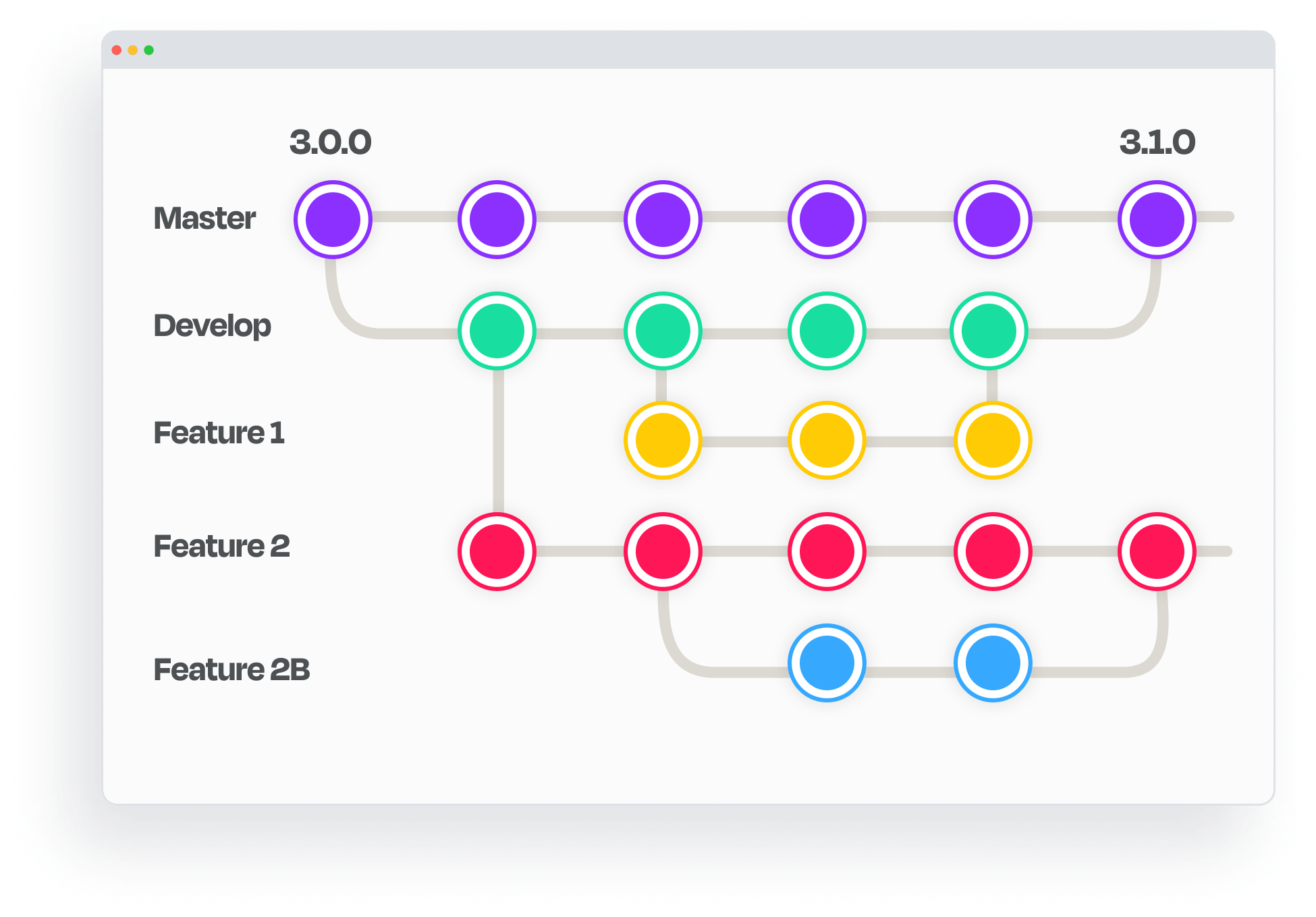
- Control analytics code with Git Integration and your CI/CD process
- Integrate AI/ML across the entire data flow
- Flexibility at scale supports data product execution
The power of Sisense in your product
Data products increase revenue
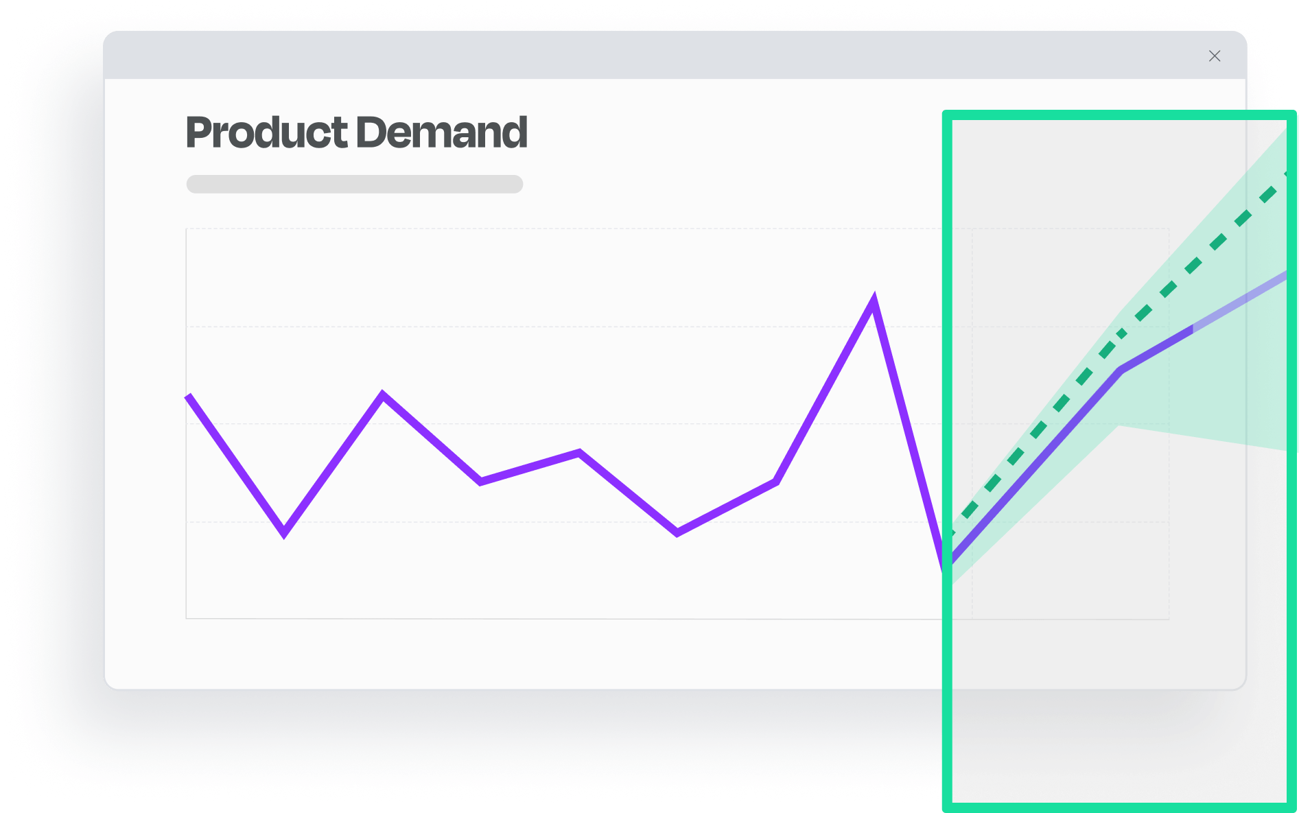
Fastest route to predictive insights
Loved by development teams
Branded by you
Operates in any cloud
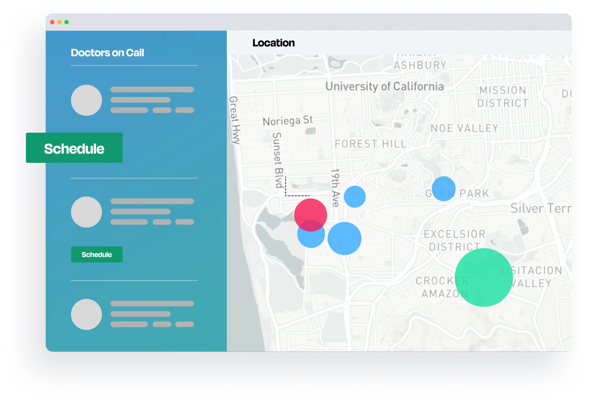
Insights fuel action
Positive Trends
Exceed customers' data expectations
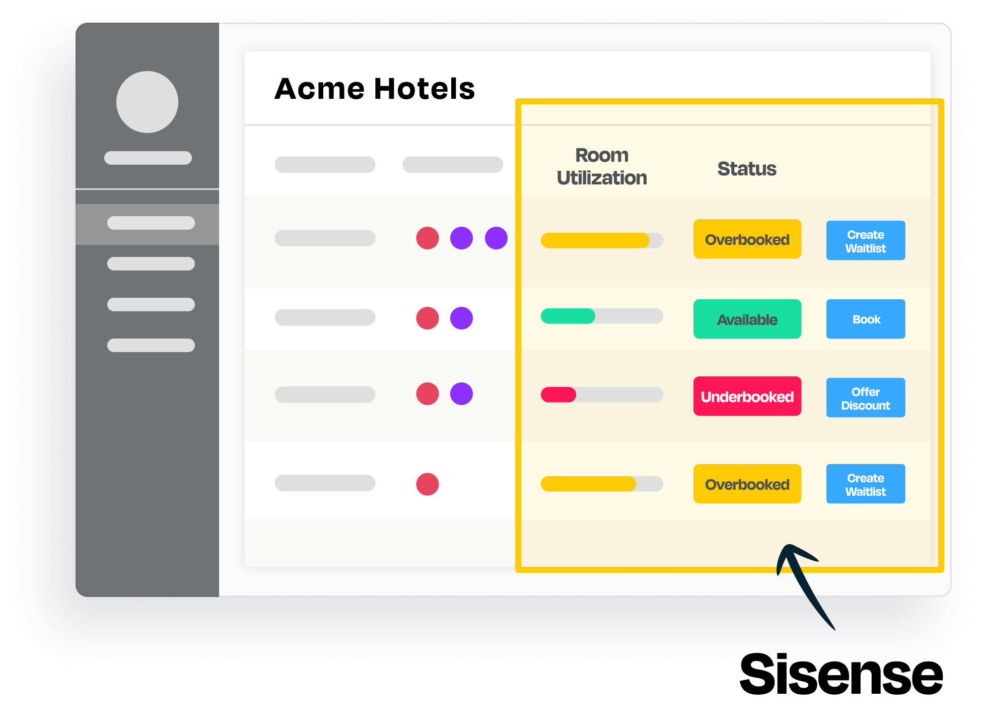
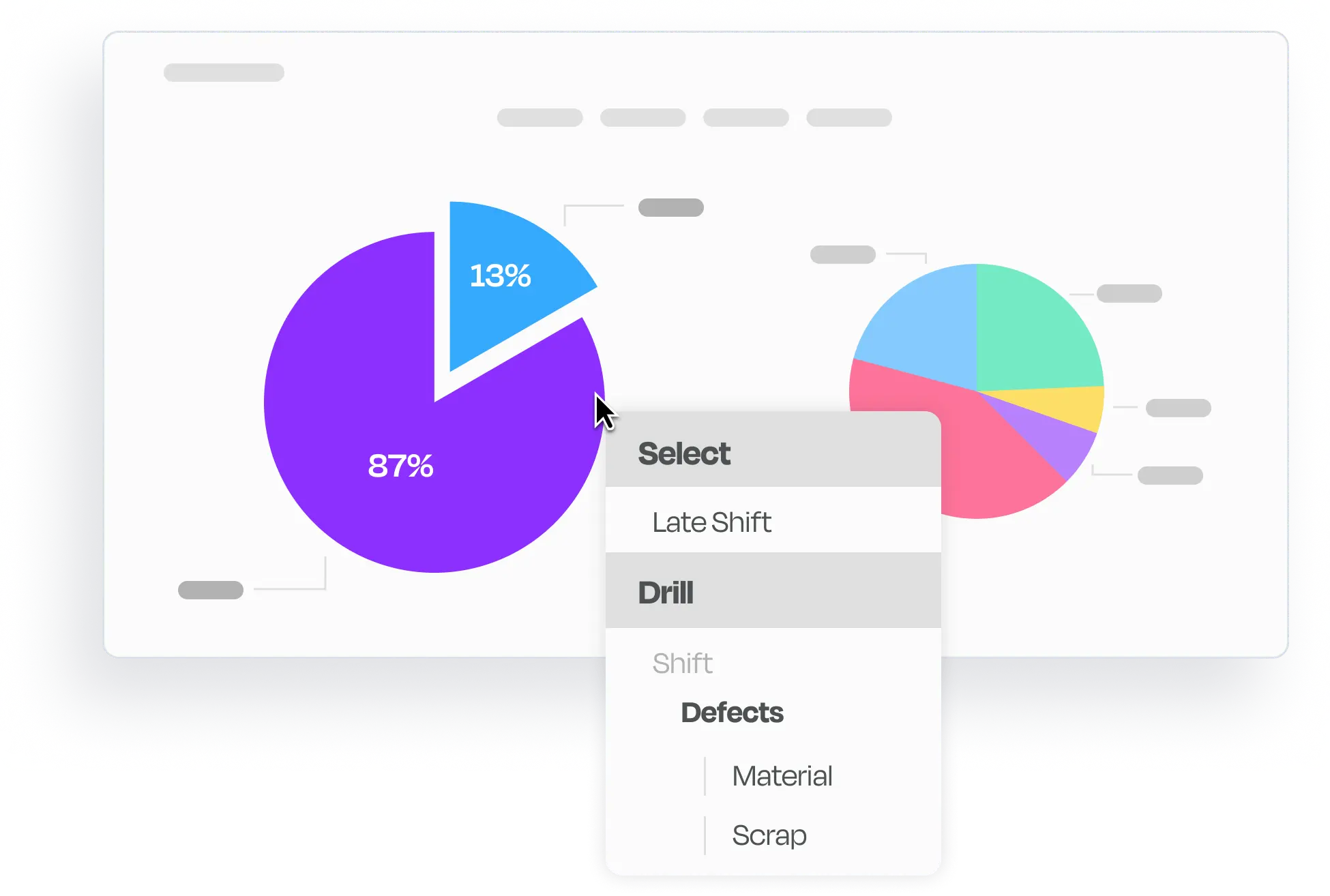
When application users ask for data, they don’t want static metrics and charts. They want data in a form that enables interactive exploration. For example, plant managers need to uncover contributing factors to their operating KPIs: the right visualization would guide the data exploration and insight discovery of their manufacturing performance.