Free
- Marketplace
Dashboard Toolbar
Read More
MARKETPLACE
By QBeeQ
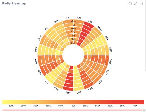
Raw data can hide crucial patterns, making it hard to detect trends, compare values, or flag anomalies, especially in complex datasets.
The Heatmap Chart transforms your data into a vivid, interactive heatmap that spotlights what matters most—where activity peaks, when issues occur, and how variables interact. Switch between radial, grid, or flattened views to fit your context, and use customizable colors, labels, tooltips, and zoom features to gain depth without clutter.
Key Features


Whether you’re mapping clicks on a website, analyzing geographic activity, or reviewing system performance, the Heatmap Chart adapts to your data and audience, surfacing actionable insights for your users.
Visit our website at www.qbeeq.io or contact us directly. For current customers requiring support, email [email protected].
The Heatmap Chart is available as a stand-alone or bundled in the QBeeQ Advanced DataViz PowerUp.
If you are interested in a live demo or want to start a free trial, visit our website at www.qbeeq.io or contact us directly.