Free
- Marketplace
Dashboard Toolbar
Read More
MARKETPLACE
By QBeeQ
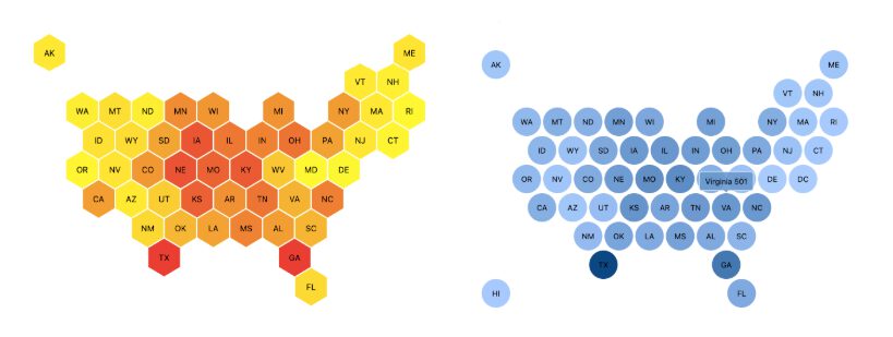
The Honeycomb Tile Map replaces the geographic outline with a grid of equal-sized tiles, one per US state, positioned to approximate their geographic layout. Each tile is colored by a value you select, using Sisense’s native conditional formatting. You choose between two tile shapes: hexagonal (Honeycomb) or square (Tile). State data can be passed as a two-letter abbreviation or a full state name.
Key Features
Ready to see the Honeycomb Tile Map in action? Explore our live dashboard!
📄 Explore the Honeycomb Tile Map documentation here.
📌 Use Cases
Comparing performance across states without size bias: When you’re tracking revenue, adoption, or operational metrics by state, a standard map makes large states look more significant than they are. Equal tiles give every state the same visual weight, so the color does the work, not the geography.
National campaign and field operations dashboards: Sales teams, field operations managers, and marketing analysts tracking state-level performance need to scan across all 50 states. A tile layout makes scanning faster and more accurate than a geographic outline, where small states get lost.
Executive and embedded analytics views: The plugin is optimized for dashboard performance and works within Sisense’s standard widget framework. It fits cleanly into dashboards built for regular use, not just one-off presentations.
Questions about fit, pricing, or setup? We’re happy to help. Contact us · Visit qbeeq.io.
The Honeycomb Tile Map is included for free in the QBeeQ Starter PowerUp. No purchase required. Get the Starter PowerUp and unlock plugins that make your dashboards more powerful, intuitive, and built for real users.