Take control of your data visualizations: Connecting to third-party libraries with Compose SDK

- Blog
- Developer experience (DevX)
We launched Sisense Compose SDK to provide developers with unmatched power and flexibility to embed analytics into their apps, exactly the way they want to. A signature benefit is that it provides engineers with an incredibly flexible way to fetch and manipulate data from Sisense, using it seamlessly within web applications, all using the latest frameworks and languages such as React and TypeScript. With Compose SDK, you can now easily flow data into the charting components you want to use, so you have the freedom to build the pixel-perfect visualization experiences your users and customers demand.
In this article, I’ll share how Compose SDK gives you the flexibility to not only use your already extensive set of charting components, but to connect Sisense data to popular third-party charting libraries, such as Plotly, MUI Charts, or Chart.js for any visualization experience you need now or in the future.
I’ll walk you through code examples of using Compose SDK components to load data from a data model in Sisense, transform, and structure it in any way required by third-party charts, and then render it. The examples will use Plotly and MUI charting components, but the flow and techniques can be applied to other charting libraries.
The code examples below should work with an existing or new React project with TypeScript. If you don’t have an existing app, follow the Quickstart guide to set up one.
Full code for the examples can be accessed at this GitHub repo: GitHub – imtuanpham/csdk-sandbox: A sandbox application for testing Sisense Compose SDK
Fetching data with Compose SDK
Before diving into the integration, it’s essential to understand how Compose SDK fetches data. The SDK provides a React hook called useExecuteQuery that allows querying data from a specific data model in a Sisense instance. The hook also handles data aggregation and data filtering if needed.
For example, in the first code snippet provided, we use the useExecuteQuery hook to fetch data from the Sample ECommerce data model:
const { data, isLoading, isError } = useExecuteQuery({
dataSource: DM.DataSource,
dimensions: [DM.Commerce.AgeRange],
measures: [
measures.sum(DM.Commerce.Cost, 'Total Cost'),
measures.sum(DM.Commerce.Revenue, 'Total Revenue'),
],
}); if (isLoading) {
return <div>Loading...</div>;
} if (isError) {
return <div>Error</div>;
}
Here, dataSource specifies the data model we’re pulling from, which in this case is Sample ECommerce. Parameters dimensions and measures define what data we want to retrieve following the dimensional modeling of your data source. In this case, we’re fetching the AgeRange dimension and summing up the Cost and Revenue measures.
Notice the isLoading and isError flags? The hook provides these to make it easier to handle various data states. You can display loading spinners, error messages, or fallback UI without any extra effort.
Visualizing data with a Plotly bar chart
Plotly.js is a high-level, declarative charting library that comes with an extensive range of chart types. It is built on top of D3.js and WebGL, which allows it to produce interactive, web-friendly visualizations with high performance. Plotly.js supports popular front-end frameworks including React, Angular, and Vue.
Once we have the data, the next step is to transform it into a format that third-party charting libraries can understand. In our example, we’re using a Plotly bar chart but the flow and logic can be applied to other libraries.
The data transformation is pretty straightforward:
const x1: number[] = []; const y1: number[] = []; const y2: number[] = []; data?.rows.forEach((row) => {
x1.push(row[0].data);
y1.push(row[1].data);
y2.push(row[2].data);
});
Here, three arrays (x1, y1, and y2) are initialized to hold values of Age Range, Total Cost, and Total Revenue. The data?.rows.forEach loop iterates through each row of the fetched data, populating these arrays.
Subsequently, two “traces” (or series) are created for the bar chart:
const trace1: Plotly.Data = {
x: x1,
y: y1,
type: 'bar',
name: 'Total Cost',
}; const trace2: Plotly.Data = {
x: x1,
y: y2,
type: 'bar',
name: 'Total Revenue',
}; const plotData = [trace1, trace2];
Each trace represents a set of bars on the chart. trace1 represents the “Total Cost” bars, and trace2 represents the “Total Revenue” bars.
The transformed data can now be used to create various types of charts. While the specifics may vary depending on the library, the general approach remains the same.
const layout = {
title: 'Total Cost and Revenue by Age Ranges',
xaxis: { title: 'Age Range' },
yaxis: { title: 'Cost and Revenue ($)' },
width: 900,
height: 500,
}; return <Plot data={plotData} layout={layout} />;
The layout object defines representation properties of the chart, such as its title, axis labels, and size. The Plot component then takes in the plotData (which contains our two traces) and the layout to render the bar chart.
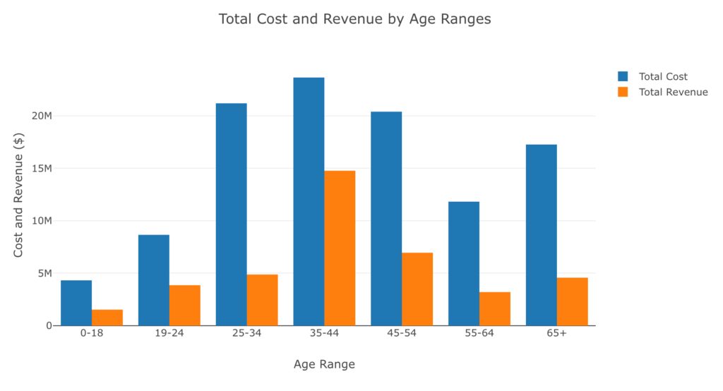
Plotly bar chart showing Total Cost and Total Revenue by Age Range
Visualizing data with a MUI bar chart
The same flow from the previous example can also apply to the MUI charting library. However, the data transformation for MUI Bar Chart is slightly different:
const dataset =
data?.rows.map((row) => ({
ageRange: row[0].data,
totalCost: row[1].data,
totalRevenue: row[2].data,
})) || [];
Here, we’re mapping through each of the rows, which is an array, and creating a new object that has ageRange, totalCost, and totalRevenue properties.
For the layout of the chart, you’d define your x-axis, y-axis, and data series, much like you would in any charting library.
<BarChart
dataset={dataset}
xAxis={[{ scaleType: 'band', dataKey: 'ageRange', label: 'Age Range' }]}
series={[
{ dataKey: 'totalCost', label: 'Total Cost', valueFormatter },
{ dataKey: 'totalRevenue', label: 'Total Revenue', valueFormatter },
]}
yAxis={[
{
label: 'Cost and Revenue ($)',
},
]}
width={800}
height={500}
margin={{ left: 100 }}
sx={{
[`.${axisClasses.left} .${axisClasses.label}`]: {
transform: 'rotate(-90deg) translate(0px, -50px)',
},
}}
/>
In the above code, the xAxis prop defines the x-axis of the chart, and the series prop defines the data series that will be displayed.
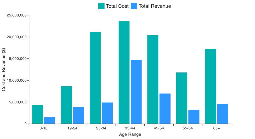
MUI Bar chart showing Total Cost and Total Revenue by Age Range
Combining multiple chart types into a hybrid chart
MUI’s charting library allows for combining multiple chart types. In the third code example, we’ve combined a bar chart and a line chart in a single visualization. In addition to a bar chart showing Cost and Revenue on the left y-axis, we show a line chart of sales Quantity on the right y-axis.
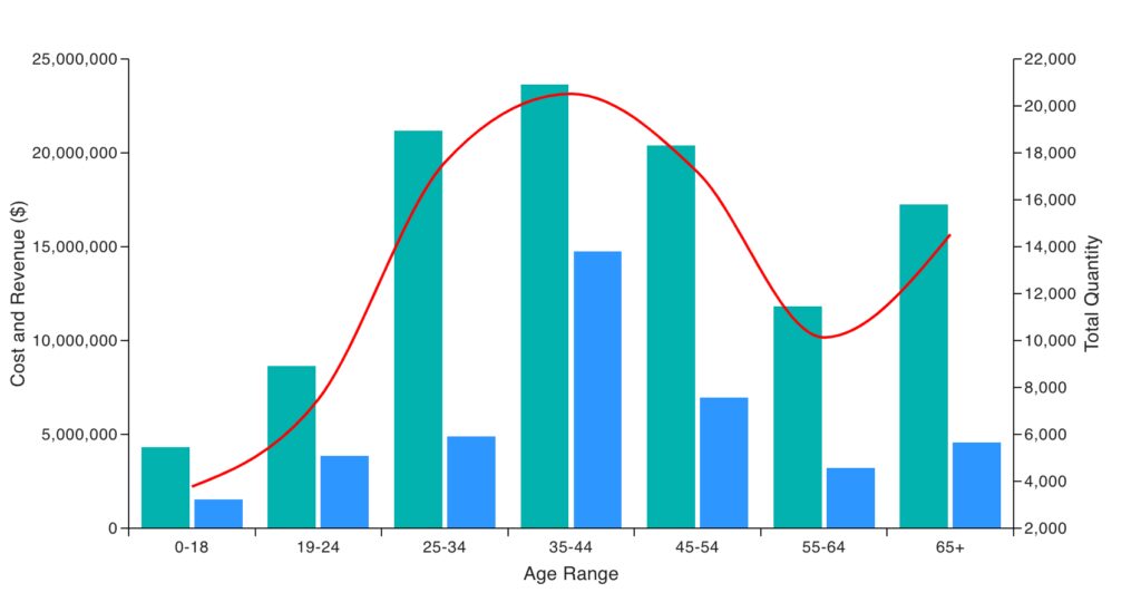
Hybrid chart showing Total Cost, Total Revenue, and Total Quantity by Age Range.
In general, this is achieved using the ChartContainer component, which acts as a wrapper for multiple chart components:
<ChartContainer ...>
<BarPlot />
<LinePlot />
...
</ChartContainer>
Inside the ChartContainer, we’ve added both BarPlot and LinePlot components, allowing us to visualize both bar and line charts simultaneously.
To fetch the Total Quantity for the line chart, the data fetching hooking is extended to include the measure for Quantity:
const { data, isLoading, isError } = useExecuteQuery({
dataSource: DM.DataSource,
dimensions: [DM.Commerce.AgeRange],
measures: [
measures.sum(DM.Commerce.Cost),
measures.sum(DM.Commerce.Revenue),
measures.sum(DM.Commerce.Quantity),
],
});
The data transformation requires some adjustment to build separate arrays for each of the series:
const seriesAgeRange = data?.rows.map((row) => row[0].data) || []; const seriesTotalCost = data?.rows.map((row) => row[1].data) || []; const seriesTotalRevenue = data?.rows.map((row) => row[2].data) || []; const seriesTotalQuantity = data?.rows.map((row) => row[3].data) || [];As you may recall, this transformation is very similar to the logic for the Plotly bar chart in the first example. Here, the map() method on the rows array is used, instead of forEach(), to introduce you to different techniques to achieve the same structure for the transformed data.
The series array is then created to specify the types of charts and associate them with the corresponding y-axes:
const series = [
{
type: 'bar',
yAxisKey: 'costAndRevenue',
data: seriesTotalCost,
},
{
type: 'bar',
yAxisKey: 'costAndRevenue',
data: seriesTotalRevenue,
},
{
type: 'line',
yAxisKey: 'quantity',
color: 'red',
data: seriesTotalQuantity,
},
] as AllSeriesType[];
Putting all together, the ChartContainer from MUI is used to render the chart:
<ChartContainer
series={series}
width={860}
height={500}
margin={{ left: 100, right: 100 }}
xAxis={[
{
id: 'age',
data: seriesAgeRange,
scaleType: 'band',
valueFormatter: (value) => value.toString(),
},
]}
sx={{
[`.${axisClasses.left} .${axisClasses.label}`]: {
transform: 'rotate(-90deg) translate(0px, -50px)',
},
[`.${axisClasses.right} .${axisClasses.label}`]: {
transform: 'rotate(-90deg) translate(0px, 35px)',
},
}}
yAxis={[
{
id: 'costAndRevenue',
scaleType: 'linear',
label: 'Cost and Revenue ($)',
},
{
id: 'quantity',
scaleType: 'linear',
label: 'Total Quantity',
},
]}
>
<BarPlot />
<LinePlot />
<ChartsXAxis label="Age Range" position="bottom" axisId="age" />
<ChartsYAxis label="Cost and Revenue ($)" position="left" axisId="costAndRevenue" />
<ChartsYAxis label="Total Quantity" position="right" axisId="quantity" />
</ChartContainer>
Here, ChartContainer is configured with various props like series, width, height, xAxis, and yAxis to customize the chart. Inside ChartContainer, BarPlot and LinePlot components render the bar and line charts, respectively. ChartsXAxis and ChartsYAxis components are used to customize the axes.
Sign up to learn more
In this post, you learned how Compose SDK gives you total control in fetching and manipulating data from Sisense, so you have the flexibility to visualize it using third-party libraries like MUI Charts, Plotly, or Chart.js. The approach remains the same: fetch, transform, and visualize. Simply, Compose SDK enables you to deliver the exact visualization you need, in your app, no limits. Better yet, we’ve designed Compose SDK so you can retrieve data in a way that’s tailored precisely to your needs.
To go deeper, register to join me, and the Sisense product team on Wednesday, October 11 at 11 AM EST, for a live webinar. We’ll share the inside track on Compose SDK and answer any of your questions. Sign up for “How to build next-gen data products with insights”, and if you attend, you’ll have a chance to win one of twenty $30 gift cards in a random drawing. Hope to see you there!


